New brand identity heralds a new era of growth for Ovarian Cancer Research Foundation
January 24, 2025
2025 marks the 25th anniversary of the Ovarian Cancer Research Foundation, kicking off with the launch of a complete make-over of its brand logo and visual identity.
As Australia’s leading independent funder of ovarian cancer research dedicated to transforming outcomes for the most lethal women’s cancer, the OCRF envisages a future where those impacted by ovarian cancer can live healthy, vital lives. For the majority of women diagnosed in 2025, the reality is that fewer than 50% will survive for five years.
To reflect our ambitious goals and our determination to help change the stats and rewrite the stories, OCRF is proud to present a new, distinctive and memorable visual identity.
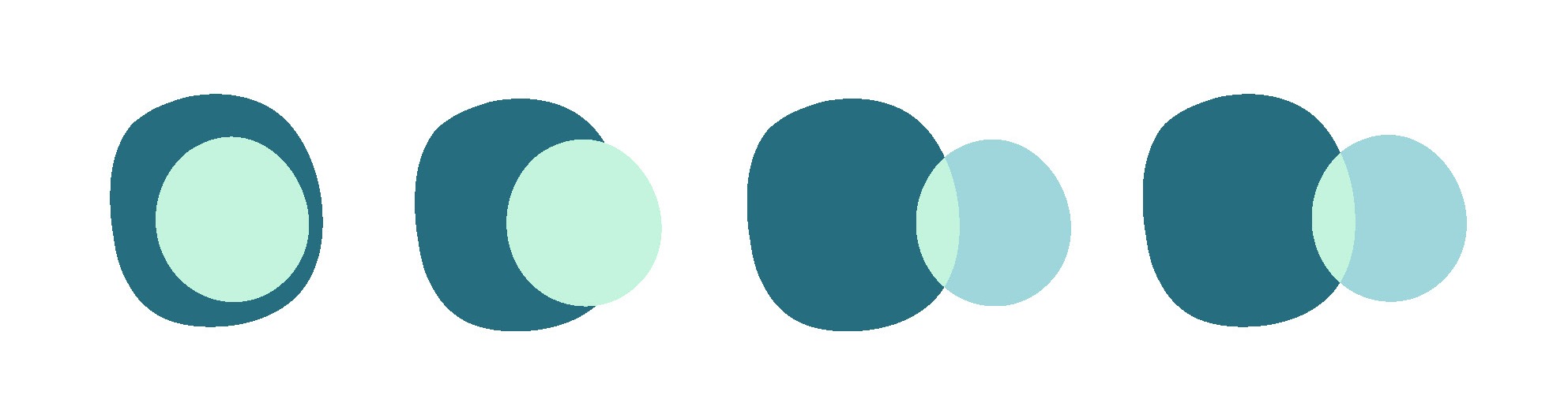
O is for…
The new brand centres around the letter and shape of an ‘O’. This links strongly to the essence of our work - overcoming ovarian cancer, finding opportunities to accelerate progress, dogged optimism for the future, and our desire to move onward to a future in which surviving and thriving becomes the norm for anyone who faces a diagnosis of ovarian cancer.
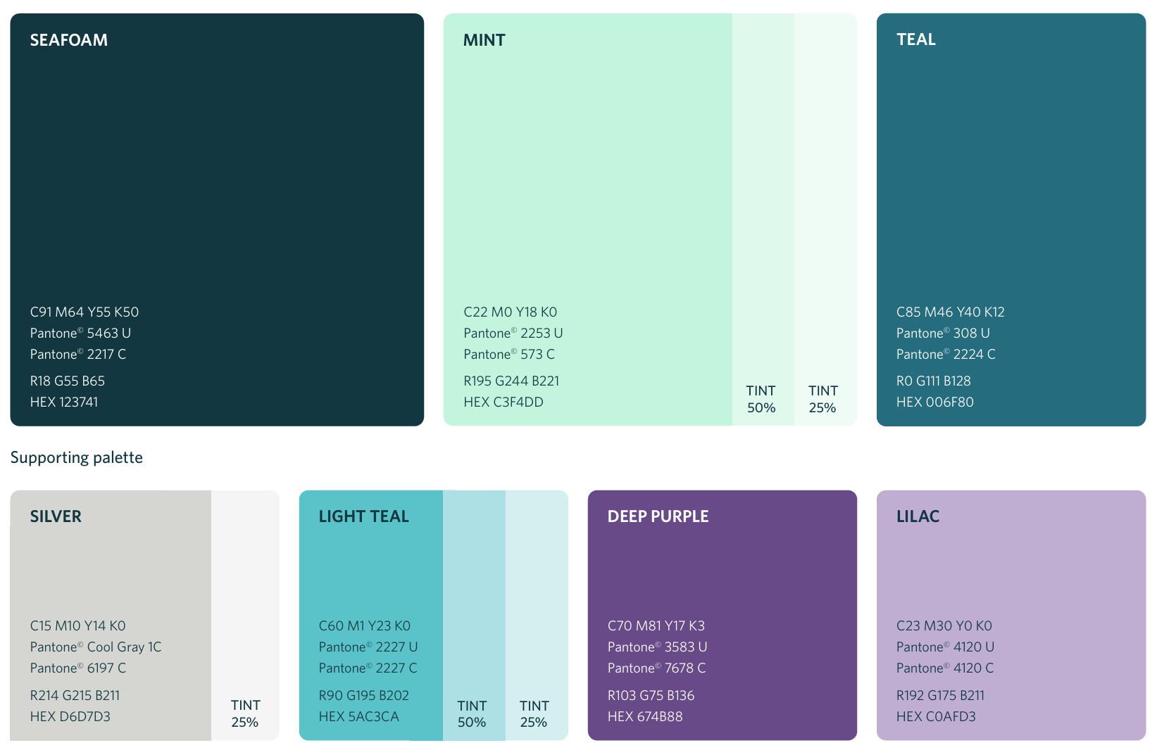
The 'O' shape used in the logo is imperfect - soft, organic, layered and connected. It alludes to a cell, an egg and the shape of an ovary. This is juxtaposed with a typeface that is clean, precise, confident and feminine, befitting the scientific nature of the organisation. The colours build on OCRF’s existing palette: central to this is the colour teal which is the internationally designated colour for ovarian cancer, plus the palette retains warm silver, in a nod to the brand’s previous black, white and silver logo.
The palette brings in two shades of purple, a colour that references the broader group of gynaecological cancers and hints at historical links to the suffragette movement, and women’s rights – still a focus for us as we strive to redress systemic underfunding and poor understanding of the impacts of the disease. In addition of mint green denotes renewal and growth, important elements for OCRF as we celebrate this milestone year, as well as for the women and girls who inspire our work.
Memorable and dynamic
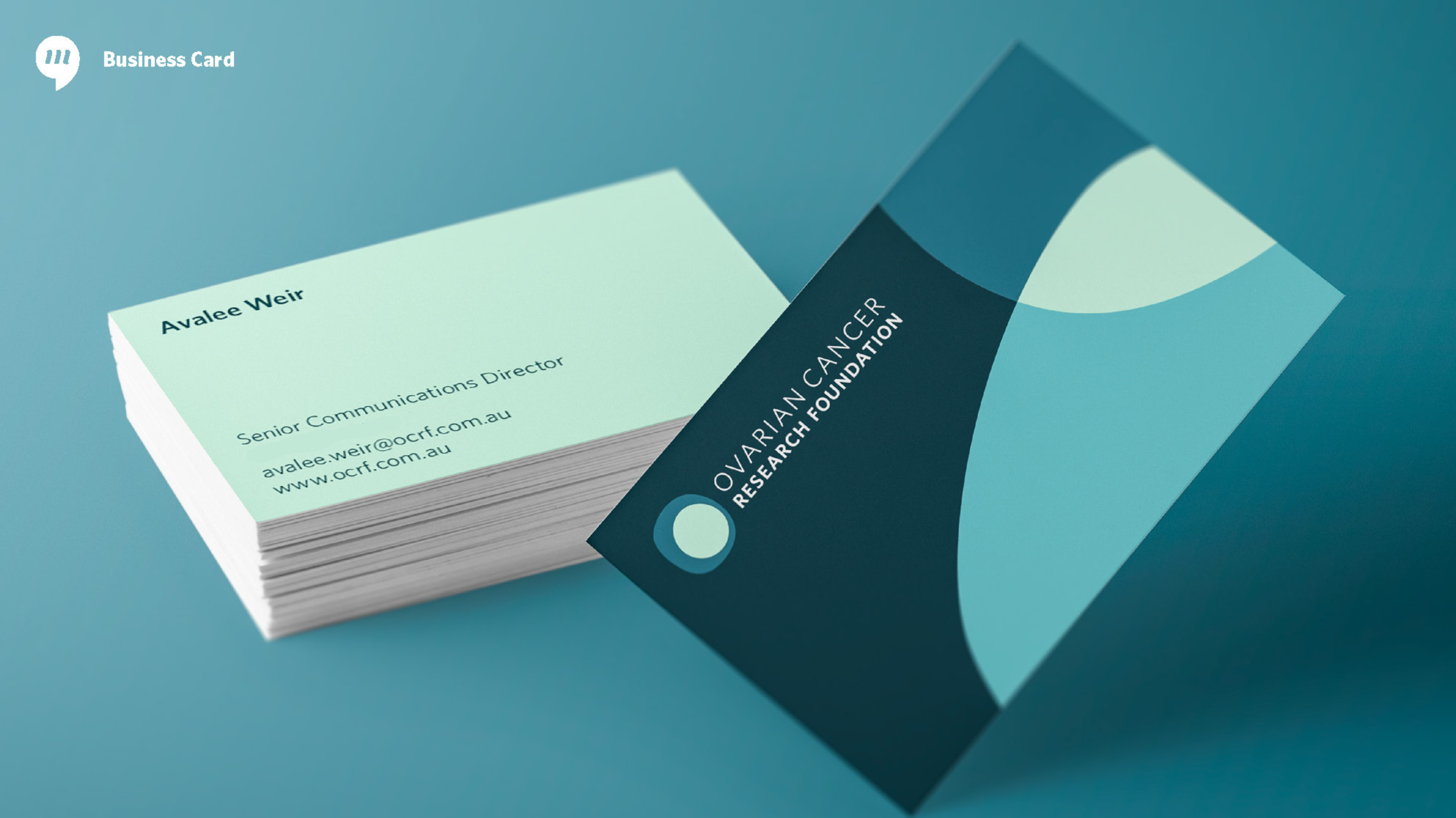
“This new brand emerged from extensive consultations and fantastic creative from the team at Marlin Communications. The result is an exciting and important step as we kick off OCRF’s 25th anniversary year,” said Avalee Weir, OCRF’s Senior Communications Director.
“The new design signals the start of a vibrant and dynamic next chapter for the organisation. The logo and visual identity are representative of our purpose, they’re relevant and memorable plus they’re highly flexible, designed for use across a wide range of applications,” she said. “Importantly, the design also echoes our tone of voice – positive, ambitious and confident – a message that will become even clearer when we launch our new five-year strategy in late February.”
Design concepts and development: Marlin Communications
Logo animation: Eric, Tom and Bruce

Get the latest news, stories & updates.
